Three Months with Microsoft's Office 365
by Vivek Gowri on January 31, 2013 11:59 PM EST- Posted in
- Microsoft
- Cloud Computing
- Office 2013
- SkyDrive
Windows and Office. It’s a duo that has made up the core of Microsoft’s business since before I was born, and remains the cornerstone upon which the rest of the company is built. And so it has gone, for as long as I can remember: with each new version of Windows, a refreshed edition of Office to go along with it.
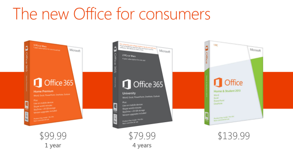
This year, we’ve got Office 2013. We’ve obviously had some experience with it in Windows RT form, and I spent a fair amount of time using the Office 15 Consumer Preview last year (in fact, I wrote my Masters thesis in Word 2013 Preview). In the grand scheme of things, it’s a pretty major change, with the biggest probably being the move towards a subscription-based model, though you can still buy Office in a traditional retail boxed edition with a standalone license. There are four different options for the standalone version of Office 2013: Home & Student (Word, Excel, PowerPoint, OneNote, $139.99), Home & Business (adds Outlook, $219.99), Professional (adds Publisher and Access, $399.99), and a volume-channel only Professional Plus with InfoPath and Lync for large businesses.
The interesting part is Office 365, which involves paying on a yearly basis for multi-device licensing and cloud storage. It’s worth clarifying the naming scheme here: Office 2013 refers to the latest version of the Office suite, while Office 365 refers to a subscription service that provides Office 2013 applications. Office 365 Home Premium and Office 365 University both come with the same set of programs (Word, Excel, PowerPoint, OneNote, Outlook, Publisher, Access) along with 20GB of SkyDrive storage, 60 Skype minutes, and multiple device installations (5 for 365HP, 2 for 365U). It’s a pretty sleek system, with all of Microsoft’s cloud services leveraged to provide a seamless experience. Obviously, this isn’t the first time we’re seeing cloud-based document storage and backup, but the SkyDrive integration in Office 365 is much deeper than we’ve seen in the past.
Now, with a subscription model, pricing is obviously key. I think Home Premium’s yearly $99.99 fee is a bit ambitious, but the University edition at $79.99 for four years is actually a pretty great deal. The only downer with 365U is that it only has support for two device installs, as opposed to five with Home Premium, but that’s the price you pay for getting an 80% discount. A university ID is, naturally, required at the time of purchase. (Thank god that most of my friends are still undergrads.)
| Office 2013 - Consumer Editions | |||||
| Variants | Office 365 Home Premium | Office 365 University | Office Home and Student 2013 | ||
| Price | $99.99 | $79.99 | $139.99 | ||
| Subscription Time | 1 year | 4 years | - | ||
| Device Installs | 5 | 2 | 1 | ||
| SkyDrive Storage | Free + 20GB | Free + 20GB | Free (7GB) | ||
| Skype World Calling | 60 mins | 60 mins | - | ||
| Office Programs | Word, Excel, PowerPoint, OneNote, Outlook | Word, Excel, PowerPoint, OneNote, Outlook | Word, Excel, PowerPoint, OneNote | ||
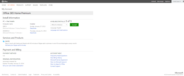
Let’s focus on Home Premium for now, as it’s the version that we’re testing and also the most relevant consumer product in the entire Office 2013/365 lineup. At $99/year, it offers a lot of value if you’re planning on using it on 4-5 devices, but if you’re only putting it on one or two devices, that sounds a bit steep. If it were in the $50-80 per year range with two or three licenses included and additional device installs available for $10 each or so, that’d be much easier. This also eliminates the problem for users wanting to install it on more than 5 computers. As presently constituted, to get more than 5 device installs, you need to buy another Office 365 subscription using a different Microsoft ID. With a typical family of four, it’s not even that difficult to think of having more than 5 computers, even if my occupation makes my household collection of computers a bit of an exception. Basically, it’d be nice to see a bit more flexibility in the plan with regards to the number of licenses available, along with this being reflected in the pricing scheme.

Setup is painless, with a simple executable (or .dmg for Mac installs) downloaded after creating or signing in with a Microsoft ID and entering your serial number. There is no DVD-based install, that has been retired in favor of purely digital distribution. The awesome thing here is that you can start using Office applications almost immediately, with many of the installation tasks being pushed to the background. Compared to the lengthy Office installs of old, this is a vast improvement.


113 Comments
View All Comments
guidryp - Friday, February 1, 2013 - link
Totally disagree.Monochrome icons all look the same on first glance. You need to waste more time deciphering them.
The flat featureless crap was windows in the early 1990's.
It is also totally ridiculous that you like Aero more, but you are willing to give it up and defend flat monochrome because Microsoft is pushing that fashion.
Talk about sheep.
Tetracycloide - Friday, February 1, 2013 - link
It's ridiculous that you can't make a coherent argument about UI design without calling someone a sheep because they don't agree with your position...Parhel - Friday, February 1, 2013 - link
You must be new to tech sites. This is where the socially maladjusted come to call everyone who disagrees with them 'Sheep'.guidryp - Friday, February 1, 2013 - link
I am not calling him a sheep for disagreeing with me.I am calling him sheep because he is willing to abandon what he actually likes better, to follow the latest fashion MS dictates.
"... althoguh I like windows 7 aero style more, but...."
Nothing quite as sheep like as abandoning what you actually prefer to follow a new corporate directive.
FunBunny2 - Friday, February 1, 2013 - link
C'mon. The Great God Steve refused to make a color-tubed machine and one with a hard drive. Events caught up with him, but he was convinced.Wolfpup - Thursday, March 7, 2013 - link
This has nothing to do with "old-fashioned". This has to do with useability. Shadows and the like weren't introduced randomly or for fashion, they were introduced because they're more FUNCTIONAL. Removing them for fashion's sake is insane and incompetent.Cygni - Friday, February 1, 2013 - link
Agreed. The UI is absolutely terrible. The flat monochromes and ALL CAPS TEXT in 1998 era fonts. Just looks horrifically bad.steven75 - Sunday, February 3, 2013 - link
It's so bad if my employers forced this version of Outlook in me I'd be tempted to retreat to the web access version.crispbp04 - Friday, February 1, 2013 - link
Chrome and useless flash is JUNK. Are you also impressed by old Honda civics with fart pipes, a 4 foot wing, and a crappy paint job?Maybe it's time to look in mirror and ask why yourself "Why am I a cynical hater?" It's possible that it will expose the core reasons why you're being an unoriginal bandwagon hater drone, instead of someone who backs up their rants with facts and examples.
I understand that "haters gon' hate" and try to invent bogus reasons to support their ignorance, but at the end of the day, it shines through nonetheless.
colonelpepper - Friday, February 1, 2013 - link
you're hilarious....look at your own screed.