Moto X Review
by Brian Klug on August 26, 2013 1:30 PM EST- Posted in
- Smartphones
- Qualcomm
- MSM8960
- Motorola
- Android
- Mobile
- Android 4.2
- Moto X
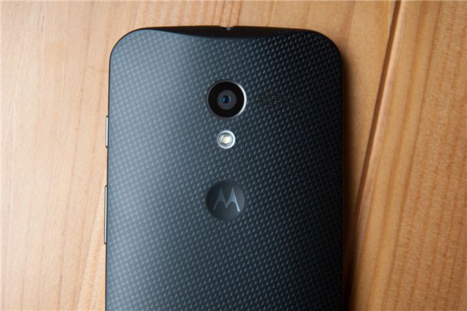
It has been a long time since I’ve seen a smartphone so fervently rumored, discussed, hyped, and finally announced like the Moto X has been. The level of buzz surrounding the Moto X slowly built to nearly messianic levels just before the official announcement, after which point we were given the device for a hands on and initial impressions. Hype aside, Motorola built considerable attention for the Moto X, now the question is how the device really stacks up to the competition.
For Motorola, the Moto X is a hugely aspirational phone. If the name doesn’t already make it somewhat obvious, this is literally the device that Motorola is relaunching itself under. Greater still, the Moto X is the first device built and released under its new Google ownership. While it’s obvious that Google didn’t buy Motorola solely for its product portfolio, it’s still an important data point for its mobile strategy, to say nothing of how closely the rest of the Android hardware vendors are probably watching this launch. Motorola did an awesome job timing its announcement and release window, giving us just short of a month of time with the Moto X before release date crept up, something I wish more handset makers would do instead of the usual 1 week rush.
For me, reviewing Motorola phones seemed to be a constant affair up until the acquisition and Motorola quieting down. The breadth of its handset portfolio seemed to dwindle down to essentially only Droid branded handsets for Verizon, to the point that many considered Motorola a de-facto Verizon handset ODM. That’s not to say Motorola didn’t make interesting phones, like the RAZR i or M for example, but it certainly quieted down.
All of that changes with the Moto X, which will launch on the five major wireless network operators in the USA (Verizon, AT&T, Sprint, T-Mobile, US Cellular), in addition to a version sold on Google Play, and two Developer Editions (one for Verizon Wireless, another general North American WCDMA/LTE version) with unlockable bootloaders direct from Motorola. Motorola now effectively joins Samsung and HTC in the Android space by getting its branding and device portfolio consistent and uniform across the operator landscape. There are still a lot of variants of the Moto X, but the upside is that almost all the possible combinations are covered for the US, Latin America, and Canada.
Physical Impressions
There’s been a narrative lately about smartphones and their ever increasing size. It’s shocking to me that this far into the mobile device surge, the industry hasn’t quite settled down on one clear optimal display size, with flagships getting bigger each successive generation. I’d posit that the optimal size is somewhere just shy of 5-inches diagonal, say between 4.7 and 5, but this is a subject of heated debate.
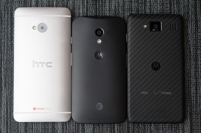
HTC One, Moto X, RAZR MAXX HD (Left to right)
While there are definitely smaller phones out there, the problem is that handset makers divide up their portfolio along display size lines. Smallest ends up being low end, medium ends up being midrange, and the largest devices end up being the flagships. If you want that midrange sized phone, that ends up putting you squarely in midrange territory, and therein lies the problem - smaller shouldn’t automatically connote midrange.
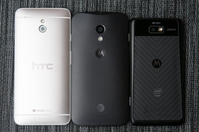
HTC One mini, Moto X, RAZR i (Left to right)
The Moto X is positioned as an Android handset that fills exactly that niche - a flagship phone with a still quite big display (4.7-inch diagonal) but not quite as big as the 5-inch flagships, and overall smaller 2D dimensions, all while being flagship. Or at least, that’s one part of the unstated goal of the Moto X. Size is kind of a tired discussion at this point, so much so that I feel like a broken record talking about it each device, but the Moto X is clearly on the smaller side of the spectrum right now.
The easiest thing to talk about is the in-hand feel of the Moto X. The short version is that the rounded backside of the Moto X is more ergonomic than most, but the plastic it gives way to halfway along the lip makes it feel like relatively standard fare. After you get over that plastic on the front, however, the shape is great and there aren’t any sharp edges to get hung up on or cause discomfort when held to the face during a call.
The long story is that the Moto X design allegedly reflects Google’s data-driven approach to just about everything. Google’s guidance to Motorola on the Moto X was something along the lines of - go get a statistical sampling for device size and shape, do a user study and gather feedback, and then build the phone that optimizes for positive feedback.
I’m not sure what the size of Motorola’s sample was, but it clearly was enough to convince Google. I’ve always wanted to design a phone something like that - get 3D data on a huge number of human hands, then empirically derive the optimal size and shape for a device, and engineer a phone around those constraints. The reverse of that is most often what happens during device design - the display I want to fit inside has this aspect ratio, I have to fit this much board area for the platform inside, and then fill the resulting empty space inside the cube with battery. The mechanical engineering, industrial design, and RF design of a smartphone are really three competing things all pulling different ways.
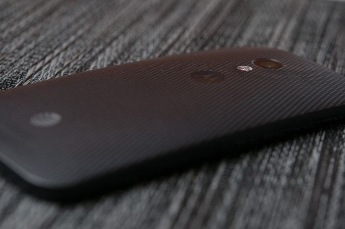
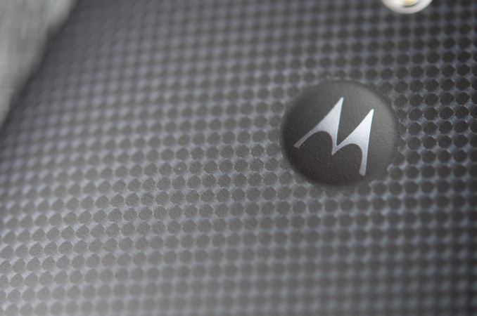
The result of that data is the Moto X’s unique backside curve, which isn’t a spherical or cylindrical shape but rather a more complicated quadratic one. Holding the phone, you can see how this plays out - the Moto X is thicker at the top than it is at bottom, with the thickest point peaking at the Motorola dimple. Similarly, the rolloff in thickness from side to side changes depending on height. It’s a really hard to describe curve that seems much more organic than the extruded rectangle shape of traditional devices. I can’t deny that the Moto X shape seems almost natural when held in the hand during normal use or when held to the head during calls. The Motorola-logo dimple also does double duty by serving as a great way to tell if you’ve pulled it out of your pocket in the right orientation.
Like other vendors with a curved back shape, Motorola fills as much of this volume as possible with components required for a phone. HTC chose to fill its rounded devices with a stack of battery, then PCB, Motorola goes for a monolithic single-sided PCB (a regular design staple for Motorola instead of the double-sided L shaped PCB), then tops it off with a stepped battery made by LG. So much of in-hand feel is a byproduct of the internal construction, and putting that the volume formed by the rounded section to use with a stepped, stacked battery is critical.
Materials are the other axis of in-hand feel and quality. Here Motorola continues to use composites with the default woven white and woven black. If you’ve held the Kevlar Droid RAZR or the composite-backed RAZR HD, you’ll know exactly what I’m talking about, as that seems to be the same material as what’s employed here. One of the other material choices is a more traditional polymer with soft touch, which is the case of the different colors available if you go the customization route through Moto Maker which we’ll talk about later. Last are wood options which won’t be available at launch but rather sometime later in Q4 - teak, bamboo, rosewood, and ebony will be choices. The wood is sealed with a clear layer, to both prevent damage but also stop water from being absorbed and causing unintended attenuation of RF signals.
I’ll say that I’m spoiled and colored by my time spent using metal phones as of late, but the composite-backed Moto X still seems of higher quality than the plastic used by some of the Korean handset makers.
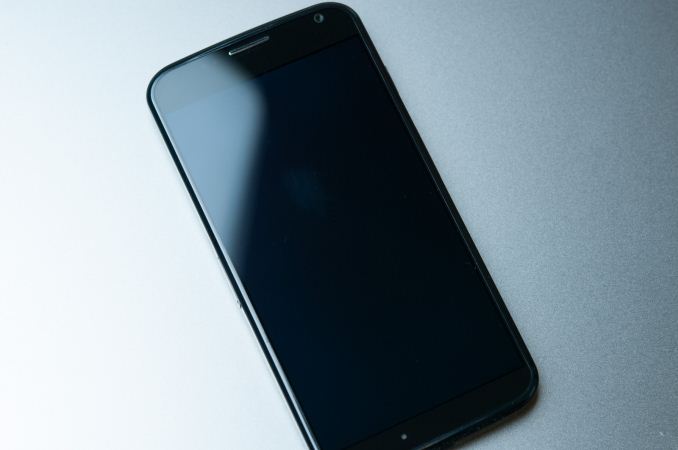
Motorola’s unique materials story continues on the front with a fused glass-plastic layer. The front glass and touch panel are fused into the plastic lip which rings the top side of the Moto X. They’re not separate parts, but literally fused together into one. Motorola is very proud of this feature since it results in one unbroken surface instead of the usual pressure-fit plastic ring affair with a raised section or gap. I can still detect a bit of a seam where the glass-plastic interface is, but it’s so much less than what I normally encounter on other devices.
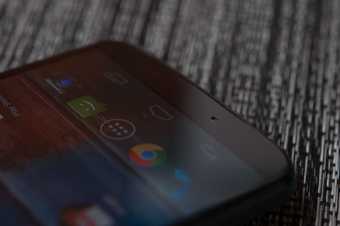
The top and bottom of the Moto X also have a small raised plastic lip, which lets you lay the phone front-down on a surface without the display glass resting coplanar and picking up scratches from any dirt or dust in-between. This is a subtle but important feature given the Active Display feature and the display-down emphasis that’s part of it. The Moto X also feels great held to the head with this rounded unbroken curve - a lot of other handsets with sharp edges really start to hurt after a while on long conference calls, and the Moto X feels notably better than the competition in this regard. The front facing camera is off to the extreme right, the earpiece is a small centered slit, and to the left is the ambient light and proximity sensor.
There are three microphones on the Moto X for ambient noise reduction on calls and for ASR (Automatic Speech Recognition). One on the front at bottom just off-center, one on the back facing out, and one at top next to the headphone jack. Motorola was the first to put three microphones on its devices, and this continues with the Moto X, even if I suspect this is still a beamforming system that uses the microphones in pairs.
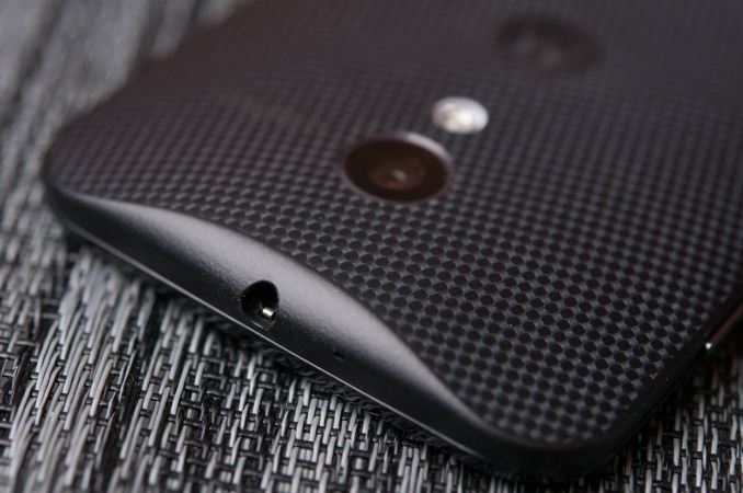
At the bottom is a microUSB port, at top in the thick region at center is the headphone jack.
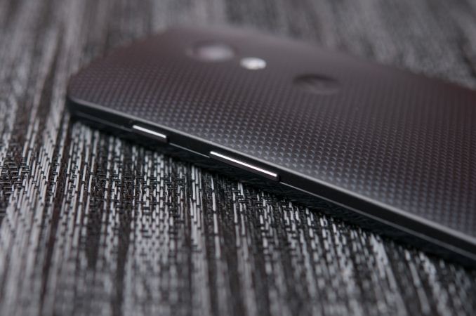
The left side is home to the Moto X’s nanoSIM tray, which makes it one of the few new devices embracing nanoSIM besides the iPhone 5. At right is the single piece volume rocker and power button above it. The buttons feel positively clicky and are easy to locate, but can be pushed around up and down and rattle slightly.
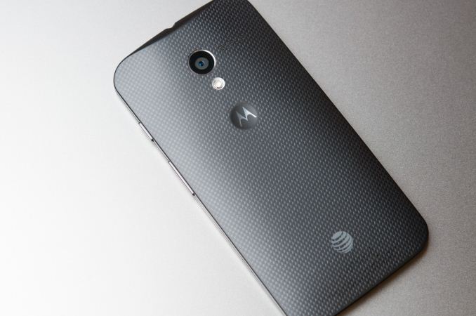
The backside is again home to a secondary microphone, rear facing camera and LED flash, speakerphone grille, and Motorola logo. The speakerphone is a series of small holes to the right of the camera aperture and rather traditional mono. The backside also carries AT&T branding at the bottom, which is rather unfortunate. The upside however is that there isn’t any on the front of the Moto X.
The Moto X ends up being a uniquely shaped device that lends it great in-hand presence, and makes it incredibly pocketable. I also have to applaud Motorola for its above average material quality. The Moto X is not small by 2012 standards, but smaller than most of the 2013 competition, something that it plays off as a positive rather than a negative. It truly is crazy to think that a device the size of the Moto X is now considered on the smaller side of the spectrum.
| Moto X | |
| SoC |
Qualcomm Snapdragon S4 Pro (MSM8960Pro) 1.7 GHz Motorola X8 System (SoC+NLP Processor+Contextual Processor) |
| Display | 4.7-inch AMOLED (RGB) 1280x720 |
| RAM | 2GB LPDDR2 |
| WiFi | 802.11a/b/g/n/ac, BT 4.0 |
| Storage | 16 GB standard, 32 GB online, 2 years 50 GB Google Drive |
| I/O | microUSB 2.0, 3.5mm headphone, NFC, Miracast |
| OS | Android 4.2.2 |
| Battery | 2200 mAh, 3.8V, 8.36 Whr |
| Size / Mass | 65.3 x 129.3 x 5.6-10.4 mm, 130 grams |
| Camera |
10 MP Clear Pixel (RGBC) with 1.4µm pixels Rear Facing 2 MP 1080p Front Facing |
| Price | $199 (16 GB), $249 (32 GB) on 2 year contract |




105 Comments
View All Comments
Friendly0Fire - Monday, August 26, 2013 - link
I looked for a good replacement for my Nexus S which also had good sound quality and damn that's a hard task especially in NA. I just couldn't find anything short of ordering an international SGS4 and that's just way too expensive.It always makes me sad that we strive for these huge and pretty screens but entirely botch the audio outputs in most smartphones.
kwrzesien - Tuesday, August 27, 2013 - link
Second this. A comparison to tablets would be a great contrast too...we find the iPad 3 headphone out to a Yamaha/Klipsch system superior to any phone (iphones and Androids), would be interested to see the results of the Nexus and Note tablets. Maybe including a comparison of Bluetooth (3/4) and Wi-Fi wireless sound too.tuxRoller - Monday, August 26, 2013 - link
No comment about its superior dynamic range? To my eye, it looked better than even the pureview 1028.Of course, you can't get past the moire artifacts, and lower spatial resolution.
Dan123 - Monday, August 26, 2013 - link
How about the standby efficiency and how it affects battery life. I've seen some reports that it's not so good. You mentioned in the conclusion that you compared battery life without and without the touchless controls, I'd be interested to see how this feature affects standby efficiency.PC Perv - Monday, August 26, 2013 - link
I can't get over the whole irony around the mid-range phone and mid-range screen size. I thought the criteria used to determine "high-end," "mid-range" was the price. The reviewer says this phone is first high-end phone that doesn't sport a large screen, then turn around to say the price is a bit high. Can you get that? It is a high-end phone but the problem is that it's priced as one.Too funny.
Sm0kes - Monday, August 26, 2013 - link
I think your missing the meaning of "high-end". A high-end phone is typically in reference to hardware specifications, design, construction quality, etc.. While this is typically directly related to price (bleeding edge tech and industrial processes cost more), a high price does not automatically mean quality.Also, the facts are pretty clear (for whatever reason) that in the last couple of generations the larger phones tend to have better specs than there smaller counterparts (e.g., HTC One vs. HTC One Mini).
Mondozai - Monday, August 26, 2013 - link
I think you're missing the point.Your sentence:
"While this is typically directly related to price (bleeding edge tech and industrial processes cost more), a high price does not automatically mean quality."
Which is right, but why do you later not connect this statement with the original comment you were replying to? The Moto X is specced like a 2012 phone but is priced like a high-end 2013 phone, especially as the LG G2 is coming out in a matter of weeks and the Note 3 is announced within just 9 days. That doesn't make it a bad phone, but there's a disconnect on the pricing.
kwrzesien - Tuesday, August 27, 2013 - link
The new gold iPhone will be the *only* high-end phone when it comes out.Honest Accounting - Monday, September 16, 2013 - link
What makes the specs 2012? Number of CPU cores? screen resolution? ...mammaldood - Monday, August 26, 2013 - link
Does the Moto X support aptX like other Motorolas?