The Apple Watch Review
by Joshua Ho & Brandon Chester on July 20, 2015 8:00 AM EST- Posted in
- Wearables
- Apple
- Mobile
- Apple Watch
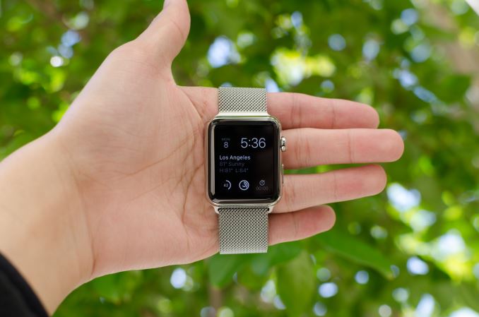
Prior to the launch of the Apple Watch, there had been rumors that Apple would make a watch for quite some time. In a broader sense, the wearables industry has become an area of significant interest as the next growth market after devices like tablets and smartphones as the high-end market became saturated and much of the growth that previously existed in the mobile space started to level out. This has resulted in a new alignment of markets and technology; the markets are ripe for a new device to recapture the wild growth of smartphones, and in the 8 years since the launch of the iPhone the inexorable march of Moore's Law has seen another 4 generations of improvements in technology. This time is finally right, it seems, to take a crack at something even smaller and more personal than the smartphone: the watch.
About two years ago, we put out our first wearable review, which examined Samsung’s Galaxy Gear. In the time since then, Android Wear has been launched, with numerous OEMs launching some form of wearable using Google’s wearable OS. However, Apple remained curiously absent from the field despite numerous rumors suggesting that Apple would soon launch a wearable. Last year, Apple announced the Apple Watch, but it wasn’t until just a few months ago that it finally went on sale.
Consequently, Apple didn’t get a first-movers advantage getting into wearables, though it remains to be seen whether that would even matter. As the creator of the iPhone and frequently on the cutting edge of technology and design, Apple had enough good will with the public to be late, and at the same time with all eyes on them they could not afford to screw up. The end result is that though by no means a slight towards Apple’s competitors, there is a clear distinction between everything that has come before the Apple Watch and everything that will come after. For the consumer market as a whole, the launch of the Apple Watch signifies that wearables have moved beyond the early adopter phase for techies, and are now being pitched at (and purchased by) the wider consumer market.
Normally, it’s easy enough to jump straight into what the device is and what’s new about said device, but in the case of the Apple Watch it’s really important that we explore the world in which this watch exists. The world is divided into people that wear watches, and people that don’t. Apple faces the distinct problem is trying to sell to both audiences, which have very different desires from a watch. The people that already have watches don’t want to give up the almost infinite battery life of conventional watches, high levels of water resistance, or anything else that is an accepted standard for watches.
The people that don’t wear watches are probably the closest thing to a clean slate that we’ll get when it comes to the wearable market. On a personal note, I fall into this camp, as I pretty much grew up in the age of widespread cellphone adoption. One of the convenient things about a phone is that they usually have the time on them, along with alarm and timer functionality. For me, this effectively meant that there was no point to wearing a watch. I also tended to have problems with the logistics involved in wearing a watch. In general, wristbands had an amazing tendency to either be too tight or too loose no matter how I adjusted the band. These issues were also compounded with any sort of physical exertion, as sweat tended to collect under the band which made wearing a watch noticeably more uncomfortable. These ergonomic issues, combined with the lack of functionality in a watch, ultimately made me stop wearing watches. Even before cellphones, wall-mounted clocks were more than sufficient for me when it came to checking the time, although I suspect I was far too young for time to really matter all that much.
Of course, I have been trying out various wearables over the course of the past few years. Although I didn’t try LG’s G Watch, I have been able to use the Pebble Steel and Motorola’s Moto 360. However, it was really a challenge for me to find anything to say about these wearables. They could definitely tell the time, and they had some extra functionality, but many of the same problems remained. The wearables I tested just weren’t all that comfortable to wear, and due to some technology limitations both weren’t really all that compelling to use. They could manage notifications, but other than that I found the functionality to be rather lacking. I often would forget to put them on at all before setting out for the day, and when I did I didn’t feel any particular need to go back to put it on my wrist. After a few months, I completely forgot about these wearables and stopped wearing them. At the time, I honestly felt like wearables could end up being another passing fad because it seemed most wearables faced similar barriers in terms of getting people to keep wearing them. Wearables like Fitbit suffered from a pretty significant abandonment rate, and given that I did the same for both the Pebble Steel and Moto 360 it increasingly felt like this would be a persistent problem.
In this context, it seems easy for Apple to fail. Generally speaking, no one has really figured out how to solve the problem of wearable adoption, chiefly because the functionality offered often wasn’t very compelling, and broadly speaking these wearables were often not well-designed. One of the first places we can start with the Apple Watch is the spec sheet. We can speak in empty platitudes about how specs don’t matter, but in the case of something like Apple Watch they definitely will. The right components won’t ensure success, but the wrong components can ensure a poor user experience.
| Apple Watch 38mm | Apple Watch 42mm | |
| SoC | Apple S1 520MHz CPU | Apple S1 520MHz CPU |
| RAM/NAND | 512MB LPDDR3(?) 8GB NAND |
512MB LPDDR3(?) 8GB NAND |
| Display | 1.32” 272x340 LG POLED | 1.5” 312x390 LG POLED |
| Dimensions | 38.6 x 33.3 x 10.5mm, 25/40/55/54 grams (Sport/Watch/Gold/Rose Gold) |
42 x 35.9 x 10.5mm, 30/50/69/67 grams (Sport/Watch/Gold/Rose Gold) |
| Battery | 205 mAh (0.78 Whr) | 246 mAh (0.93 Whr) |
| OS | WatchOS 1 | WatchOS 1 |
| Connectivity | 802.11/b/g/n + BT 4.0, NFC | 802.11/b/g/n + BT 4.0, NFC |
| Price | $349/549/10,000 (Sport/Watch/Edition) | $399/599/12,000 (Sport/Watch/Edition) |
As we can see, Apple has elected for some relatively conservative specifications. The SoC is relatively low power in nature, and the amount of RAM is probably about right for the kinds of tasks that a wearable will be used for at this time. The display is also of a decent resolution given the display size, and all the necessary wireless connectivity is present. It is notable that Apple is using a relatively small battery, but I suspect that this is necessary in order to fit all of the hardware into the casing of the watch. At least at a high level, it looks like Apple has put the right components into this wearable. However, it's going to take a deep examination of both technology and design to really figure out if Apple has avoided the pitfalls that I've discussed. One of the first and most obvious places to go first is the industrial and material design, which is what we'll talk about next.




270 Comments
View All Comments
TedKord - Monday, July 27, 2015 - link
Holy crap. That post was longer than the review.Figaro56 - Saturday, August 1, 2015 - link
Holly crap you sound exactly like a manic depressive friend of mine. You lost me at the gazillionth POS comment.michellepennie - Wednesday, August 26, 2015 - link
Boohoo you sound the jealous type and i bet you couldn't afford one :P loldsumanik - Monday, July 20, 2015 - link
You know what Ryan, I'll give you the benefit of the doubt.Whether it was apple PR or not is irrelevant. I'll even admit I didn't even finish the entire article because it read like a kid getting a new toy for christmas explaining how magical it was.
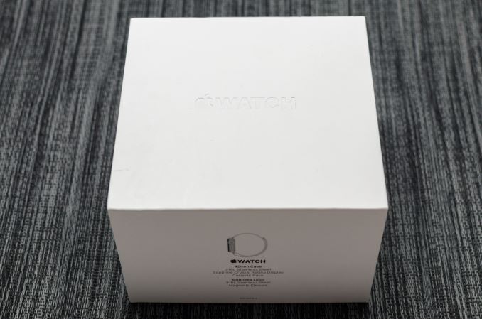
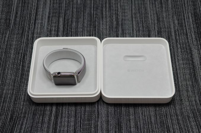
Can you explain to my why the author(s) felt the need to photograph and post not one, not two, not three, not four but FIVE neatly arranged unboxing shots... on the very first page of the article.
The shots were deliberately arranged on a cleaned, attractive, ironed cloth that tied into the watch's color scheme.
Some questions about the opening sequence of photos :
- Do you think that these shots reveal any info to your readers? Tech specs, warranty info, durability?
- Why does the EXIF info read adoble lightroom. Like gimme a break. They were enhanced.
- If we remove all verbiage, does the watch look attractive, or unattractive in any way shape or form?
- Do people generally wear a timepiece nicely draped over their fingers in front of a sunny picturesque tree?
- Is it just a coincidence that not only I but others, thought the photo's looked 'funny'?
The author(s) deliberately took time and significant effort to make the product to look as attractive as possible. The opening page, it's photographs and presentation instantly clue the reader that this piece is obviously written with heavy marketing bias and the overall tone and conclusion will be a positive one.
Is my original post inflammatory? Sure. Beligerent? yes.
100% True?
YES.
You know why this watch isn't selling? Apple's customers are thinking this:
"Cool! New apple watch! What does it do?"
"Hmm, it doesnt really do that much. I was kind of expecting more."
"You know what, it's kinda chunky and why does it stutter?...OMG, 400 bucks? pffff totally not worth it."
I know this because I am an apple customer, and this thing pretty much just sucks.
Some more questions:
- Do you think it would be good for your publication to write a scathing review of an apple product that went viral? Isn't that kind of sad?
- Would you recommend this product for a single mother, your grandma, or anyone else close to you?
- Have you thought about purchasing this product for ANYONE as a gift?
- Had this review not taken place would you have gone out and purchased this item for yourself? LOL!!!!
- Can you link me an article written on anandtech that portrayed any apple product in a negative light, ever?
I'm sorry RyanI know you are jsut doing your job but the 'general consumer' is getting smarter and the internet is getting clogged up with this kind editorial crap.
The only way to stop it is to speak up, LOUD, and be heard.
Didn't Ellen Pao just say it best?
"The trolls are winning"
By trolls, she meant the general public tha ist sick of being lied to and manipulated.
Lied to by presidents, company reps, journalists, law enforcement, intelligence agencies....right down to silly little amazon reviews.
2 weeks later he files a patent to provide an advertisement based on your bank account balance!
Call a turd a turd.
Dont photoshop it then, sprinkle whipcream and cherries on top.
Just sayin.
Ryan Smith - Monday, July 20, 2015 - link
"You know what Ryan, I'll give you the benefit of the doubt."Thank you. I appreciate it.
"Whether it was apple PR or not is irrelevant. I'll even admit I didn't even finish the entire article because it read like a kid getting a new toy for christmas explaining how magical it was.
Can you explain to my why the author(s) felt the need to photograph and post not one, not two, not three, not four but FIVE neatly arranged unboxing shots... on the very first page of the article."
The short answer is that our Apple reviews have a wider reach than our standard technical articles. The range of readers that will show up to AnandTech for a MacBook or iPhone review has a much more distinctive consumer shift than say an SSD or CPU review. And while we still have a large number of technical readers (who are our heart and soul), it's also good for us to be visible to less technical consumers, as it helps them learn that we exist and, hopefully, come back to learn things that no other site can offer.
In any case, when you're working to reach a broader audience, you need to focus on more than just words. Less technical consumers aren't going to care about the S1 analysis for example, and that's okay, because we reach these users in other ways. And one of the ways we do that is in photography. Broader audiences like pictures - they like good pictures - and that means we step up our game on photography for these reviews in order to accommodate those users. There are a number of other sites out there reviewing the Watch, and there is a segment of the broader audience that will write us off in favor of another review if we show up with poor photography, so we need to make sure that not only is our analysis top notch, but our prose and imagery is competitive as well.
At the end of the day we won't make any compromises on the technical side for our regular technical readers, but if we can also bring wider consumers into the fold through materials such as improved photography, we will do that as well. This way both techies and non-techies alike can enjoy our articles and learn something from them.
mapesdhs - Tuesday, July 21, 2015 - link
Irony is, if the photos were 'poor', someone would be complaining about that instead. Ya can't please all of the people all of the time...Ian.
Schickenipple - Tuesday, July 21, 2015 - link
It's sad, Ryan, that you actually had to explain this to someone. I thought your core readers would understand that an Apple Watch review isn't in the same category as a NVMe PCIe SSD. Guess not.bo3bber - Saturday, July 25, 2015 - link
Ryan, just wanted to observe that this approach has had the opposite effect on me. I used to come to AnandTech as my absolute goto first tech site, and these Apple puff pieces made me question your other reviews. So instead of improving your reach, at least for me, you reduced your reach because I feel that I cannot trust you as much as I did.The fact that Anand himself also left to go to Apple would strongly suggest you be wary of running Apple stuff that is fluffy.
I only read the summary, because the out-of-box first page showed me it was going to be a puff piece not a technical review.
I think you do yourself a disservice and have damaged your brand by trying to reach a larger market.
Samus - Tuesday, July 21, 2015 - link
They clearly haven't paid attention to the high production value of ALL Anandtech articles over the past decade. You guys use top notch photography and lightboxes all the time. These comments are ridiculous.The Reddit fallout must have sent trolls to every corner of the internet.
victorson - Wednesday, July 22, 2015 - link
Ryan, I do respect Anandtech coverage a lot and Josh has done some great research articles that I'm still digesting. However, I have to agree with others: this review just reads strangely lacking in perspective. It is choke-full of weird claims about watchOS being the iOS in the watch world, and about all that first-gen BS that gets throw around. Why is it that every tech reviewer would gladly slam a device for its poor functionality, but once we start talking about Apple, suddenly you guys chicken out and rather than saying that it's shit, you say that 'well, it lags like hell, but that's okay, because it's a first gen product.' And how about commenting on the lack of any actual useful functionality on the watch that would make users spend a ludicrous $700 for a single-core 500MHz processor running a 1.5" display? Don't get me started on forgetting to mention that other competitors have always-on screen (the WatchOS is a sore disappointment) AND come with two days of battery life. AND half the price! But no, rather than giving us some insightful comments on that, we get the 'I'm definitely convinced in the smartwatch now'. Thanks, very useful! /s