The In Win 303 Case Review: Minimalist ATX with Tempered Glass for $93
by E. Fylladitakis on October 12, 2016 8:00 AM EST- Posted in
- Cases/Cooling/PSUs
- In-Win
- ATX
- Case
- In Win 303
- InWin 303
The Exterior of the In Win 303
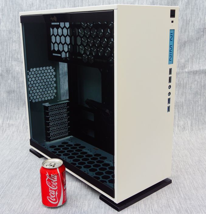
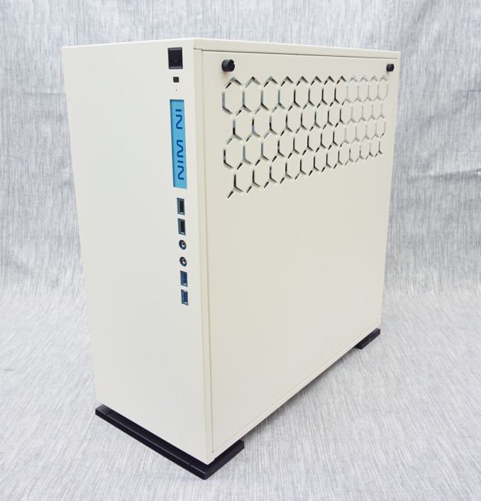
The In Win 303 visually is very simple, perhaps even excessively minimalistic. All of the case’s panels are metal and only the side panels are removable. The front and top panel of the case are entirely flat, with just the I/O ports, buttons and an illuminated panel with the company’s logo at the front of the case. We received the white version of the 303 that has white exterior metal panels, with the exception of the smoked tempered glass door (real glass, not acrylic) left side panel. The paint is very well applied. Note however that the white paint of the 303 is not perfect white or snow white, but leans slightly towards the floral white hue.
11.2 oz soda can added as a size reference.
Measuring 50 cm tall, 21.5 cm wide and 48 cm deep (19.7 × 8.5 × 18.9 in), the In Win 303 is not small for an ATX tower case. It has a volume of 51.6 liters, almost identical to that of an advanced ATX case but with optical drive bays, the Corsair 450D (also 51.6 liters). It is larger than the Zalman Z9 Neo (48.4 liters) and NZXT S340 (38.4 liters), which are relatively low-cost ATX tower cases, but it also is very heavy, tipping the scales at 11.2 kg, making it at least 50% heavier than typical ATX cases. A portion of that will be the glass panel.
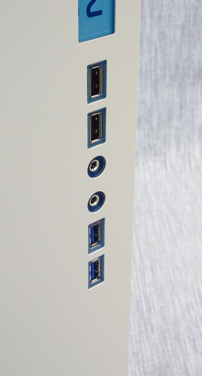
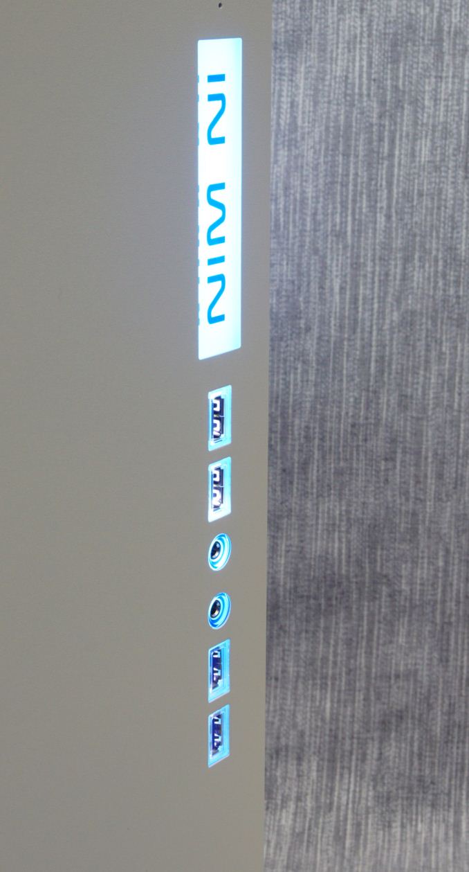
The front I/O ports and buttons can be found across the right side of the front panel. A large square Power On button can be seen at the top corner of the front panel, followed by a small square reset button. An illuminated panel with the company logo separates the I/O ports from the two buttons. Two USB 2.0 ports, 3.5 mm audio jacks and two USB 3.0 ports can be seen in line under the illuminated panel. These six ports also have illuminated surrounds that will stay constantly lit as long as the system is powered on.
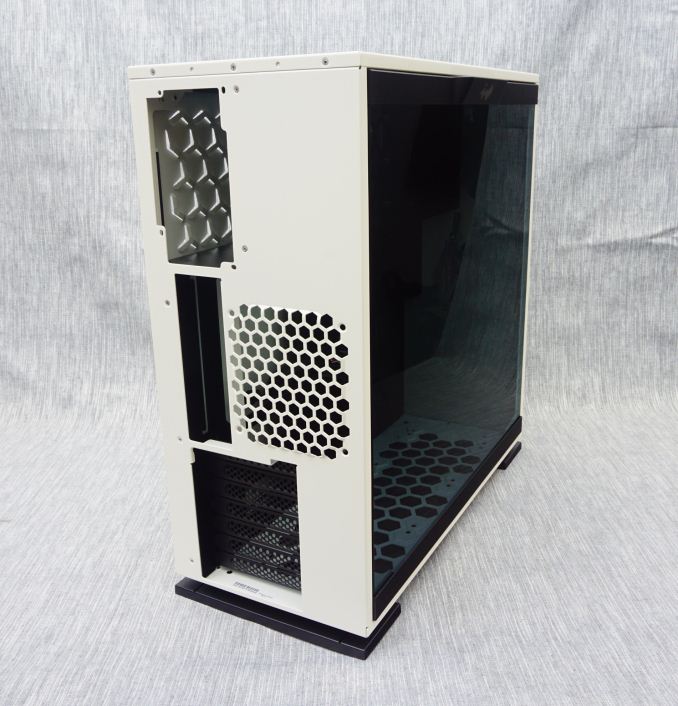
A look at the rear of the In Win 303 case hints that the interior design will be more or less atypical. The system area is at the bottom of the case and the PSU compartment is above it, resembling the classic ATX configuration. However, the PSU is mounted vertically, drawing air in from the right side panel of the case. One slot for a 120 mm fan can also be seen.
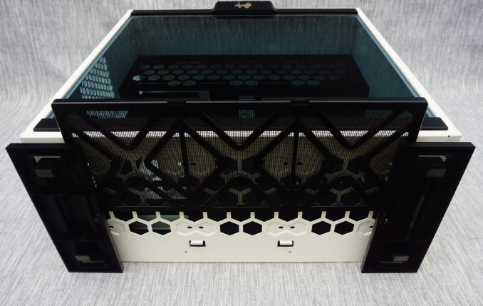
The bottom of the case serves as its main air intake. The clearance between the case and the surface is barely adequate, with the 303 standing on two large but short rectangular feet. A large nylon filters covers the entire intake, which can be removed by pulling it from the side of the case. We found this to be an excellent design choice, as the filter can be easily accessed from the side of the case. Considering the length of these filters, removal from the rear of the case is typically problematic and inconvenient, making this design a bit nicer.




43 Comments
View All Comments
luca5 - Wednesday, October 12, 2016 - link
I'd not call a case "minimalist" if it sports a gaudy logo with bright, blue LEDs on the front panel.nathanddrews - Wednesday, October 12, 2016 - link
"Minimalist" now seems to mean "no external drive bays".Samus - Thursday, October 13, 2016 - link
I built a PC out of an Inwin case awhile back that had a similar backlit logo and button array. To my pleasant surprise, the logo can be removed and changed. The guy I built it for ended up using a clear piece of 3M film and a silver sharpie to inscribe his gaming handle. It looked really good and is a hit at LAN parties, everyone can find him without looking for his placard in the dark...YukaKun - Wednesday, October 12, 2016 - link
I agree with this. The design is "simplistic", and even that is an stretch. It's just a boxy and "clean" layout.That being said, I like it a lot, but the front LED feels like unnecessary bling to an otherwise great looking case.
Cheers!
Manch - Wednesday, October 12, 2016 - link
spray paint will fix that logo window easy enough.BurntMyBacon - Wednesday, October 12, 2016 - link
I think you are confusing "minimalist" with a simplistic, understated, or muted design aesthetic. In this case, minimalist is referring to the fact that there are no external drive bays, drive cages, fans, minimal HDD/SDD mounts, and little else in the way of extra features.Of course, their own description labels this as a prominent feature: "Exquisitely Modest Aesthetic Design". I might be inclined to agree if they didn't have the "gaudy" logo front and center. The fact that it lights up puts a permanent axe in the "modest" description.
Aerodrifting - Wednesday, October 12, 2016 - link
Instead of wasting time arguing what is minimalist what is not, You guys are forgetting one of the main purposes of the computer case: Providing good airflow to cool your precious components. And I simply don't see it's possible with this case regardless what kind of fan configuration you use.The price is not bad, But it has no stock cooling so you have to invest in 2-4 case fans that can seriously push some air which this case desperately needs. I have seen lots of In-Win cases, All looks no airflow (hello, 805, 901, 909...)
fireduckzilla - Thursday, October 13, 2016 - link
I actually have this case, I'm running 7 EK Vardar fans, with 2x360mm rads... The cooling is great.Could it be 5 degree's cooler in a case with better airflow? Yes most definitely.
The real question is does it make a real world difference. Overclocked and under load it doesn't hit 70c on the GPU or Processor - plus it looks stunning. (Apart from the retarded blue logo, which I will get round to dismantling at some point.)
Aerodrifting - Thursday, October 13, 2016 - link
And how much does a 2 x 360mm rad custom liquid cooling cost?johnny_boy - Friday, October 14, 2016 - link
Don't forget about the honeycomb thing on the side. Very unminimalistic.